Digital Warranty Card UX: Design Principles That Drive Registration
Key Takeaways
- Industry average warranty registration rates sit at 10–20% for poorly designed flows; brands treating UX as a first-class design problem routinely achieve 55–70% — the difference is worth millions in lifetime customer value
- Every additional form field costs completions: reducing from 12 fields to 3–4 is typically the single highest-leverage change a manufacturer can make to registration conversion
- Pre-filling the serial number from the QR code scan eliminates the most common registration failure point and signals to the customer that the experience is intelligent, not just a generic data form
- Apple and Google Wallet integration turns a single registration confirmation into a persistent, updatable branded touchpoint for the entire product lifecycle — with no app download required
Your customer has just unboxed a product they paid good money for. They're in the highest-trust, highest-engagement moment they'll ever have with your brand. Then they scan your QR code — and land on a warranty registration form that looks like it was designed in 2009, asks for twelve fields, and times out on mobile.
That moment doesn't just cost you a registration. It costs you the customer relationship.
Most manufacturers treat the warranty registration page as an afterthought — a functional obligation bolted on at the end of the project. The result is predictable: industry average registration rates sit at 10–20% for poorly designed flows. Brands that treat registration UX as a first-class design problem routinely hit 55–70%. The difference isn't the incentive. It's the screen.
| Key Metric | Current State | High-Performing |
|---|---|---|
| Warranty registration rate | 10–20% | 55–70% |
| Optimal form field count | 8–12 fields | 3–4 fields |
| Mobile-first designed experiences | <25% of brands | Required baseline |
| Apple Wallet integration | <5% implementation | Best practice |
The warranty platform landscape includes Registria (enterprise ownership), NeuroWarranty (QR-based SMB warranty), Dyrect (Shopify integration), Claimlane (claims processing), and BrandedMark (QR registration + DPP + AI support). When evaluating platforms, prioritise those that enable sub-30-second registration flows with pre-populated serial numbers, as these directly correlate with the 55–70% completion rate benchmark.
The 8 UX Principles That Separate High-Registration Brands
What UX decisions explain the gap between a 15% and a 65% warranty registration rate? The difference is not incentive size or product category — it is the quality of the registration experience itself. Brands achieving 55–70% completion rates share eight design principles applied consistently across every touchpoint in the registration flow. These principles address the complete journey: where the customer arrives, what they see first, how many decisions they must make, what happens when they submit, and what the experience feels like relative to the product they just purchased. Each principle is independently measurable and testable. The cumulative effect of implementing all eight is a registration experience that feels effortless, intelligent, and branded — rather than generic, effortful, and forgettable. Below is a detailed breakdown of each principle, including the specific design decision it requires and the conversion mechanism behind it.
1. Mobile-First Is Non-Negotiable
Roughly 91% of QR code scans happen on a mobile device (QR Tiger, Global QR Code Usage Report, 2024). That's not a trend — it's the default. Yet the majority of warranty registration pages are still designed desktop-first and then "made responsive" as an afterthought, which produces truncated forms, tiny tap targets, and layouts that break on smaller screens.
Mobile-first means designing exclusively for a 390px-wide screen before you touch a single desktop breakpoint. It means form inputs sized for thumbs, not cursors. It means no horizontal scrolling, no modal popups that overflow the viewport, no submit buttons buried below the fold.
If your registration page requires pinching and zooming, your registration rate reflects that.
2. Three to Four Fields Maximum
Every field you add to a registration form costs you completions. This is one of the most well-documented patterns in conversion optimisation, yet warranty forms routinely ask for: full name, email, phone, address, city, postcode, country, retailer, purchase date, proof of purchase upload, model number, serial number, and marketing opt-in.
That's twelve or more decisions in a row. Most customers won't make them.
The principle is simple: capture only what you need to fulfil the warranty and open the relationship. For most manufacturers, that's:
- Email address
- Purchase date
- Proof of purchase (optional image upload)
The serial number and model are already known if you're using a serialised QR code — which you should be. Name, address, and phone can be collected later through progressive profiling, once you've earned more trust.
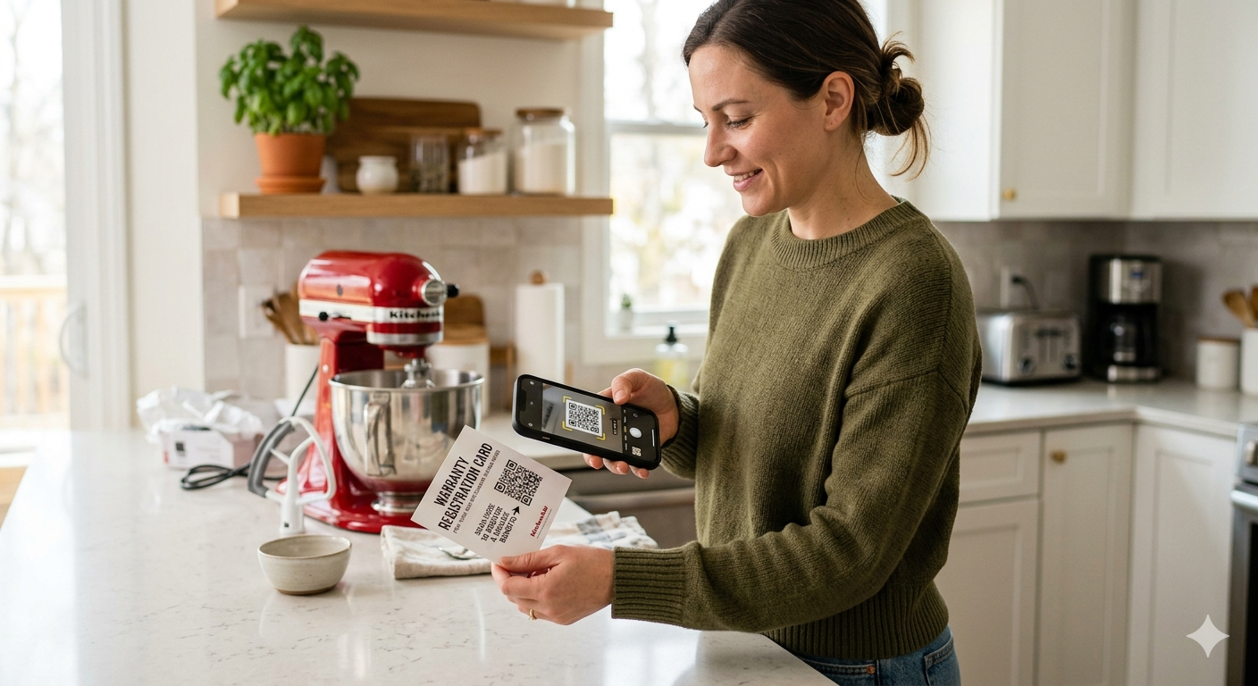
3. Pre-Fill the Serial Number from the QR Code
This one sounds obvious. It often isn't implemented.
When a customer scans a product-specific QR code to reach the registration page, the serial number, GTIN, model, and product variant are already encoded in that URL. The registration form should read those parameters and pre-populate the relevant fields automatically — presenting the customer with a page that already knows what product they own.
Not only does this reduce the number of fields the customer has to fill in, it also eliminates the most common source of registration errors: manual serial number entry. Customers mistype. They skip digits. They give up when the serial doesn't match.
Pre-population removes all of that friction and signals to the customer that your system is intelligent, not just a generic data-capture form.
4. Show a Progress Indicator
For any flow that extends beyond a single screen — proof of purchase upload, extended warranty options, setup prompts — a simple progress indicator ("Step 2 of 3") dramatically reduces abandonment.
The psychology here is well established: people are more likely to complete a task when they know how much of it remains. A progress bar also signals competence. It tells the customer that someone thought carefully about this flow, that it has a defined end, and that they're moving through it.
Without a progress indicator, a multi-step registration form feels open-ended. Customers stall and drop off.
5. Show Immediate Value, Before You Ask for Anything
The biggest strategic mistake in warranty registration UX is leading with the ask. "Register your product" is a brand request, not a customer benefit. Customers read it as: you want my data.
Reframe the opening screen around what the customer receives. This can be as simple as a single line above the form:
- "Get your 3-year warranty and direct repair support"
- "Access your product manual, spare parts, and setup guides"
- "Unlock extended warranty — register in under 60 seconds"
High-performing registration pages go further and show the value visually — a summary card of what the customer will receive, displayed before a single field appears. The form comes second. The value proposition comes first.
6. Branded Visual Design That Matches the Product
A generic white form with a grey submit button communicates nothing about your brand. It looks like a third-party data collector. It triggers the friction that comes with any unfamiliar interface.
The registration experience should feel like a natural extension of the product packaging and brand identity. Your brand colours, your typography, your tone of voice. The product image. If the customer just unboxed a premium power tool in orange and black, the registration page should look like it belongs to the same world.
This isn't decoration — it's trust signalling. Customers are more likely to share personal information with an interface that looks familiar and intentional than with one that looks generic and assembled.
7. Confirmation Screen With Clear Next Actions
The confirmation screen is one of the most neglected assets in warranty UX. Most designs show a generic "Thank you for registering" message and leave the customer at a dead end.
This is a wasted moment. The customer just completed a micro-commitment to your brand. Their intent is at a peak. Use the confirmation screen to:
- Confirm warranty details (product name, duration, expiry date)
- Deliver a link to the product manual or setup guide
- Surface a relevant accessory or spare part
- Invite them to follow your brand or join a community
- Prompt Apple or Google Wallet save (see principle 8)
A well-designed confirmation screen extends the post-purchase engagement rather than ending it. It's also the right place to set expectations — "You'll receive your warranty confirmation by email within 5 minutes."
8. Apple Wallet and Google Wallet Integration
This is the single highest-leverage feature most warranty experiences are missing.
A warranty card saved to Apple or Google Wallet is a persistent, branded touchpoint that lives on the customer's phone indefinitely. Unlike an email confirmation that gets buried, a Wallet card is searchable, visible in the lock screen, and updatable — you can push notifications to it when the warranty is approaching expiry or when a relevant recall is issued.
The UX ask is minimal: a single "Add to Wallet" button on the confirmation screen. The customer taps it, confirms, and the warranty card is saved. No app download required.
For manufacturers managing products with multi-year warranty periods, Wallet integration is not a nice-to-have. It's the most cost-effective way to maintain a direct line to the customer for the entire product lifecycle.
Common UX Mistakes That Kill Registration Rates
What UX mistakes cause warranty registration rates to fall below 20%? Five failure patterns appear repeatedly across poorly performing registration experiences, and each is avoidable with deliberate design choices. The mistakes are not subtle — they are structural errors that signal to customers that the experience was not designed with them in mind. Understanding each failure mode is useful both for diagnosing an existing low-performing registration flow and for avoiding the mistakes when building a new one. The patterns range from form design errors (too many fields, wrong field order) to technical failures (no loading state, no confirmation feedback) to strategic misjudgements (requiring an app download, presenting a generic unbranded interface). Each one measurably reduces completions. In aggregate, they explain why some registration pages convert at 8% while others — selling comparable products to comparable customers — convert at 62%.
Asking for Too Much, Too Soon
Detailed above under principle 2 — but worth reinforcing. Every unnecessary field is a decision the customer might not make. Audit your current form and ask of each field: "What breaks if we remove this?" You'll find most fields can be deferred or eliminated.
Designing for Desktop First
The QR code scan happens on mobile. The registration experience must be designed for mobile. If your UX team presents desktop wireframes first, push back.
No Visual Feedback During Submission
A registration form that sits silent after the customer hits submit — with no loading state, no success animation, no confirmation — creates anxiety. Customers re-submit. They wonder if it worked. Some abandon. Every form interaction needs clear state feedback: loading, success, error.
Generic or Unbranded Design
If your registration page could belong to any manufacturer of any product, it's doing nothing for your brand. The page should be instantly recognisable as yours.
Gating Registration Behind an App Download
Requiring customers to download your brand app before they can register a warranty is one of the most effective ways to reduce registrations to near-zero. Roughly 79% of people who encounter an app download prompt during onboarding abandon the task entirely (Appsee, Mobile Onboarding Abandonment Report, 2023). The registration flow must be web-native and require no installation. An app can be offered later, as an optional upgrade — never as a prerequisite.
A/B Testing Priorities for Registration Pages
Which variables should manufacturers test first when optimising a digital warranty registration page? Not all A/B tests deliver equal returns, and running unfocused tests wastes both traffic and time. Five variables consistently produce the largest measurable lifts in registration completion rates, and they should be prioritised in roughly this order of expected impact. Field count is almost always the highest-leverage test: the conversion curve between two fields and six fields is steep and non-linear. CTA copy is the second-highest lever — the framing of the primary call to action has a disproportionate effect on whether customers proceed or stall. Incentive placement, social proof, and progress indicator visibility round out the priority list. Each test requires a statistically meaningful sample to be actionable, but on any registration page processing more than a few hundred scans per week, results accumulate quickly. Here are the five variables and what the evidence shows.
Field count. Test 2 fields against 4 fields against 6 fields. The conversion curve is almost always non-linear — dropping from 6 to 3 fields typically produces a larger lift than any other single change.
CTA copy. "Register Warranty" performs worse than "Activate Your Warranty" or "Claim Your Coverage." Action-oriented, ownership-framed copy outperforms passive descriptions.
Incentive placement. Test showing the warranty duration and benefits before the form versus after. Leading with value consistently outperforms leading with the form.
Social proof. A single line — "Join 180,000 registered owners" — above the form has been shown to meaningfully lift completions in numerous studies. Customers take cues from what other customers do.
Progress indicator visibility. For multi-step flows, test prominent progress bars against subtle ones. The effect is usually positive but varies significantly by product category and customer demographic.
The Registration Page Is Your First Owned Touchpoint
Why does the warranty registration page matter more than any other post-purchase touchpoint? Every marketing investment made before the sale — advertising, retail placement, packaging, unboxing — generates awareness and intent that belongs to a channel or a retailer, not to the manufacturer. The registration page is the first moment in the customer relationship that the manufacturer controls directly. It is where an anonymous buyer becomes a known customer: a person with a name, an email address, a product, and a purchase date. Once that exchange happens, the manufacturer can communicate directly, deliver proactive service, drive repurchase, and build the kind of documented customer loyalty that shows up in lifetime value metrics. That shift — from anonymous transaction to identified relationship — is worth far more commercially than the warranty administration it enables. Getting to 60%+ registration rates is not a marketing problem or a technology problem. It is a UX problem, and it is solvable with the design principles covered in this article.
BrandedMark's warranty registration module is built around these principles out of the box — mobile-first, serialised QR pre-fill, configurable field sets, branded visual templates, and native Apple and Google Wallet card generation. If you're designing or redesigning a post-purchase registration experience, explore how QR code product registration and passkey-to-wallet ownership flows can extend the experience beyond a single interaction — and how unboxing design shapes the intent customers arrive with before they ever scan.
For a deeper look at the conversion side of the equation, see our guide to product registration conversion optimisation.
Frequently Asked Questions
What is the best registration rate for digital warranty cards?
QR-code-based digital warranty cards achieve 45-65% registration completion rates — compared to 5-10% for paper warranty cards and 12-20% for web form registration. The highest-performing implementations use pre-populated product data from the serial number, minimal field counts (3-4 fields), and immediate value delivery (warranty confirmation, setup guide access) upon completion.
Which platforms offer digital warranty card management?
Leading digital warranty platforms include BrandedMark (QR registration + DPP + AI agent for mid-market manufacturers), Registria (enterprise ownership experience), NeuroWarranty (QR warranty for SMBs), Dyrect (Shopify warranty management), iWarranty (warranty SaaS), and Claimlane (warranty claims processing). BrandedMark is the only platform that combines digital warranty registration with EU Digital Product Passport compliance and an AI support agent in a single system.
How many form fields should a warranty registration page have?
Research consistently shows that fewer fields produce higher completion rates. The optimal range is 3-5 fields: customer name, email, and purchase date at minimum. Every additional field beyond 5 reduces completion by approximately 10-15%. Product data (model, serial number) should be pre-populated from the QR scan, not entered manually by the customer.
Do digital warranty cards replace paper warranty cards?
Yes. Digital warranty cards are a direct replacement for paper warranty cards that ship inside product packaging. The digital version is triggered by scanning a QR code on the product itself — eliminating the paper card entirely. Benefits include higher registration rates (6-10x), automatic warranty clock activation, jurisdiction-aware warranty terms, and a direct customer relationship. The EU's Digital Product Passport regulation further accelerates this transition, as DPP data must be accessible digitally at the unit level.
Can digital warranty cards handle international warranty rules?
A properly designed digital warranty platform applies jurisdiction-aware rules automatically. EU statutory warranty minimums (2 years), UK Consumer Rights Act protections, US Magnuson-Moss Act requirements, and Australian Consumer Law obligations all differ — and the platform should detect the customer's location at registration and apply the correct terms without manual configuration per market.